Pittsburgh: Wealth and Well-Being
Does citizens' wealth and employment rate affect their physical health and mental well-being?
This project was a data visualization exercise to illuminate connections between the lifestyle, health, mental well-being, and economic make-up of the citizens in different neighborhoods in an effort to help the viewers recognize, engage in, and think critically about the important relationships.
Individual Project, Communication Design
Duration: Four weeks
Tools: Numbers, Illustrator, Sketch, Principle

Exploring data, finding connections
While parsing through all the data sets, I discovered a somewhat clear connection between the lifestyle and health of the citizens with their education and economic status.


Making data visible
Using Wurman's LATCH principles, I moved forward to organize the data and looked at the possible ways of visualizing my data from Yau's Coordinate systems. These methods helped me organize and analyze information to set the visualization's hierarchy, interaction, and narrative.

Source: Yau, N. (2013). Data points: visualization that means something. John Wiley & Sons.

Exploring the Form
Since this visualization was essentially about the citizens' quality of living, I wanted the visualization to have a more humane feeling than a very quantitative representation.
The Final Narrative

Visual layering to depict neighborhood characteristics

Interface Elements

The key stages

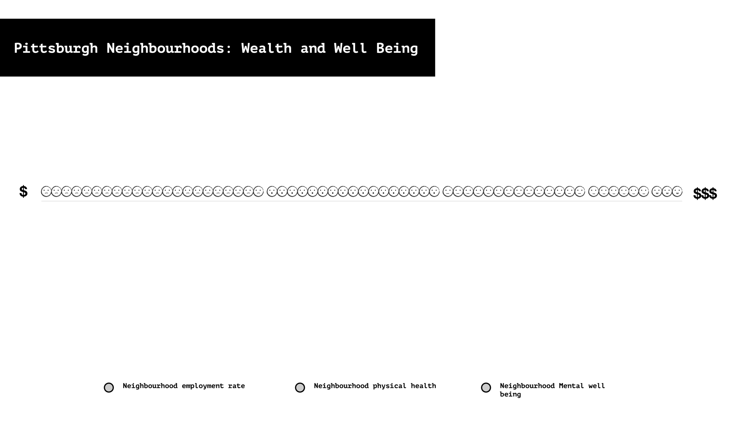
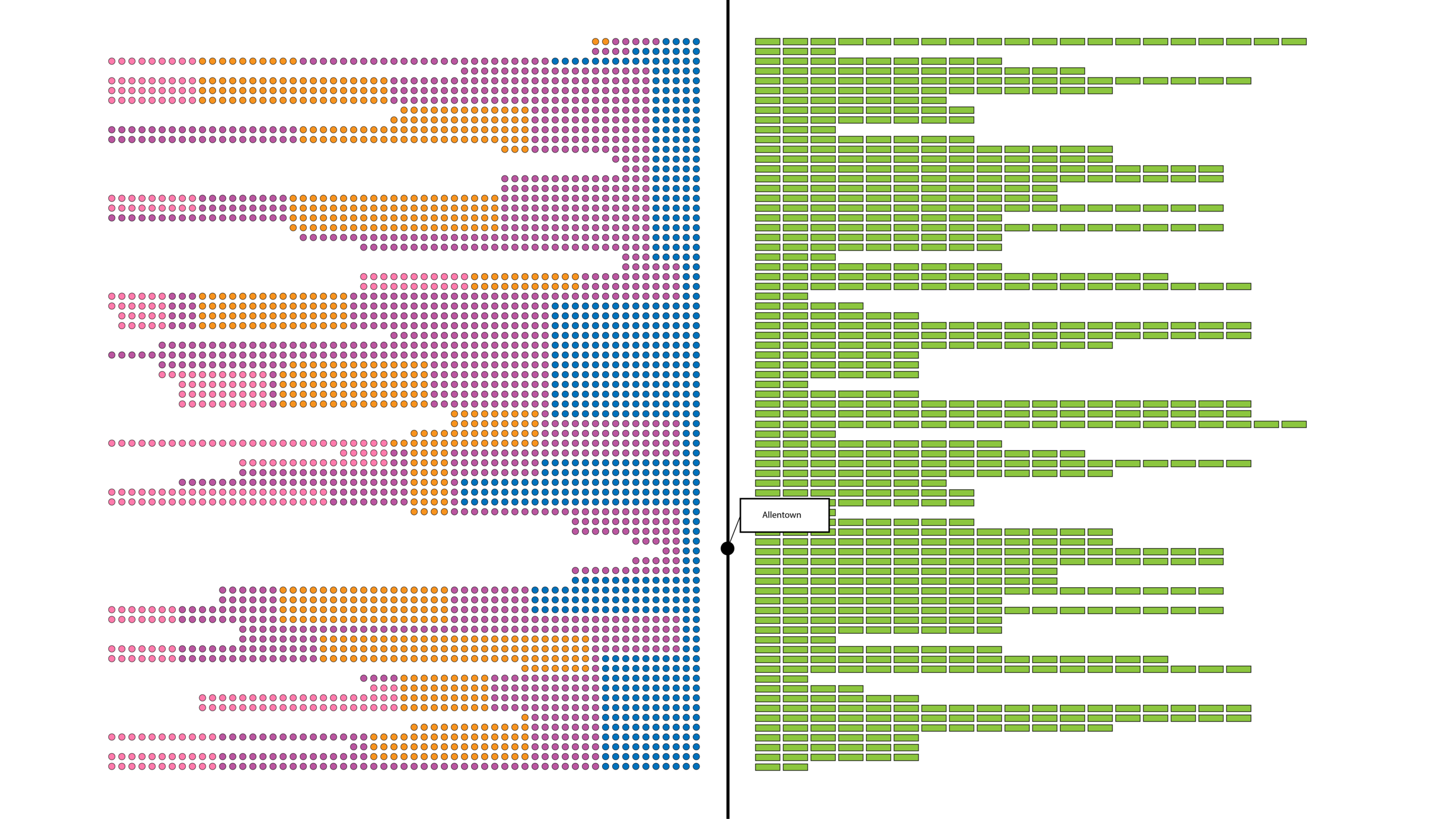
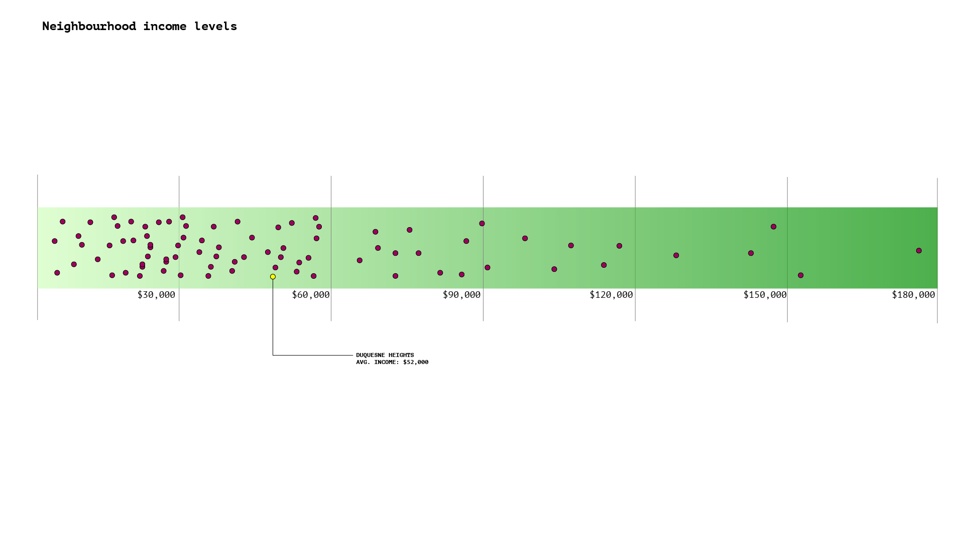
The initial screen shows a number of circles lined up horizontally on the x-axis with the $$ sign denotative of the economic factor. Not much is revealed at this stage. Through progressive disclosure one discovers information on the neighborhoods.

On hovering over the circles it is revealed that they are the different neighbourhoods in Pittsburgh. One can roll-over the circles to find out how do the neighbourhoods spread out on the income bar.

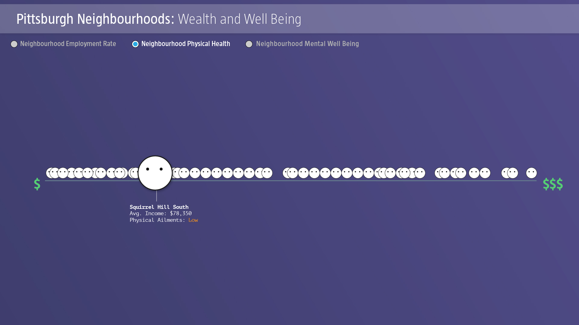
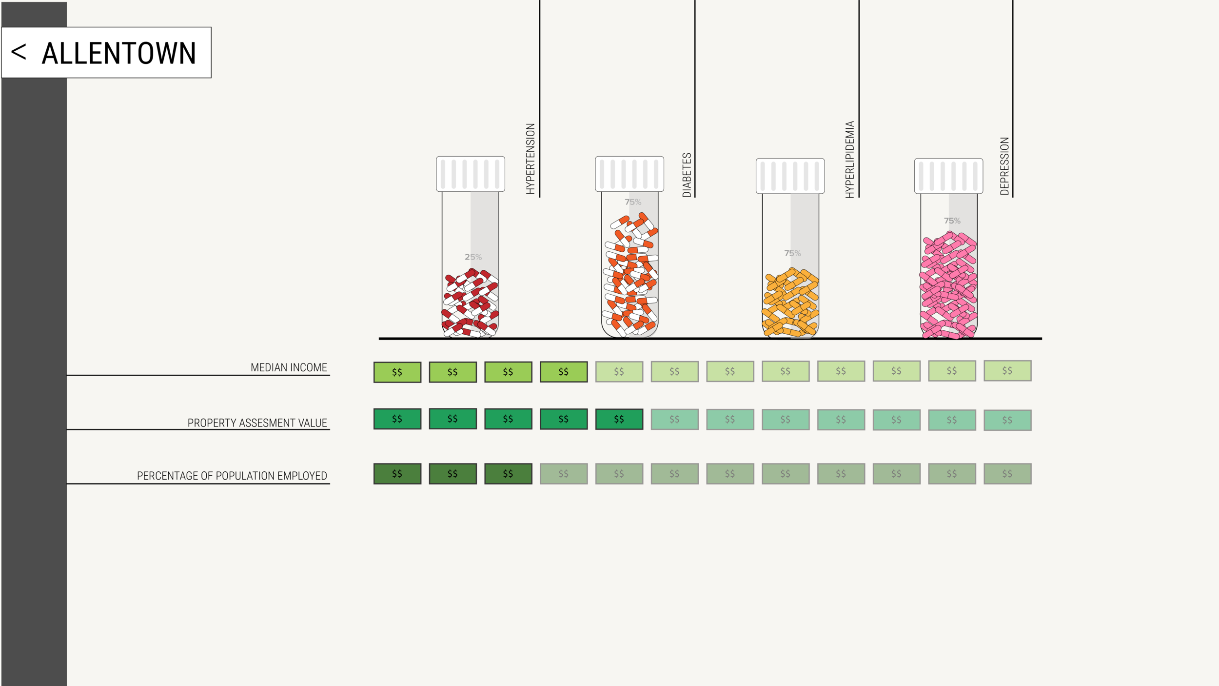
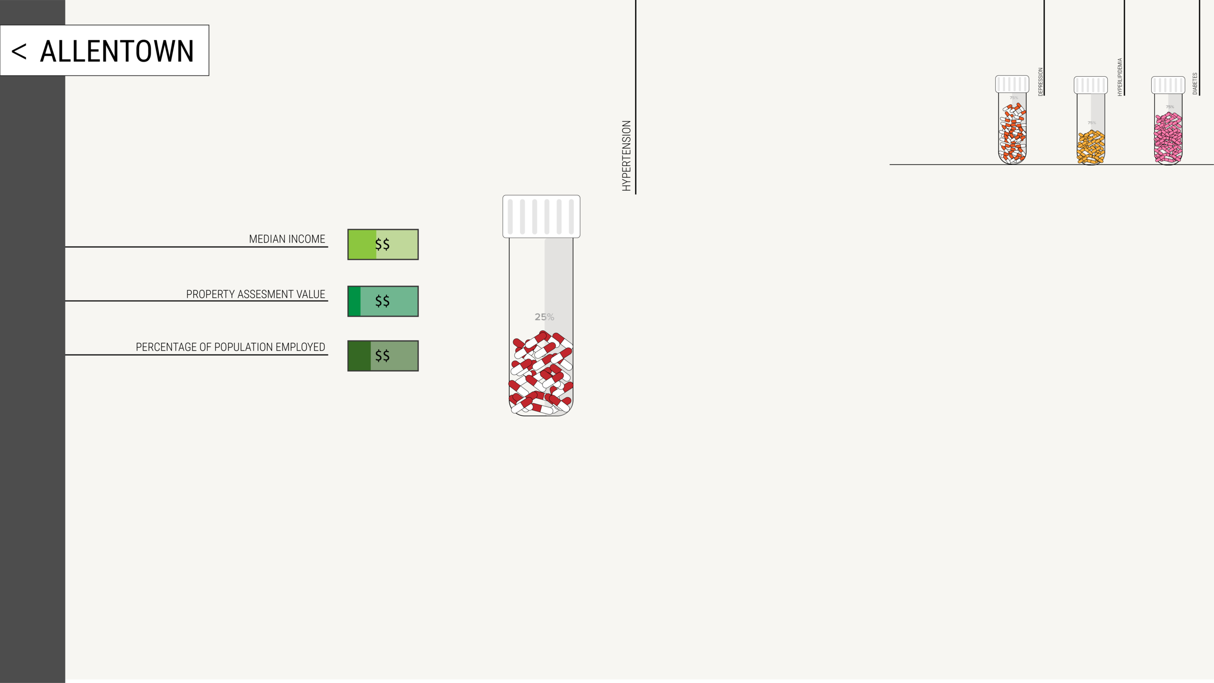
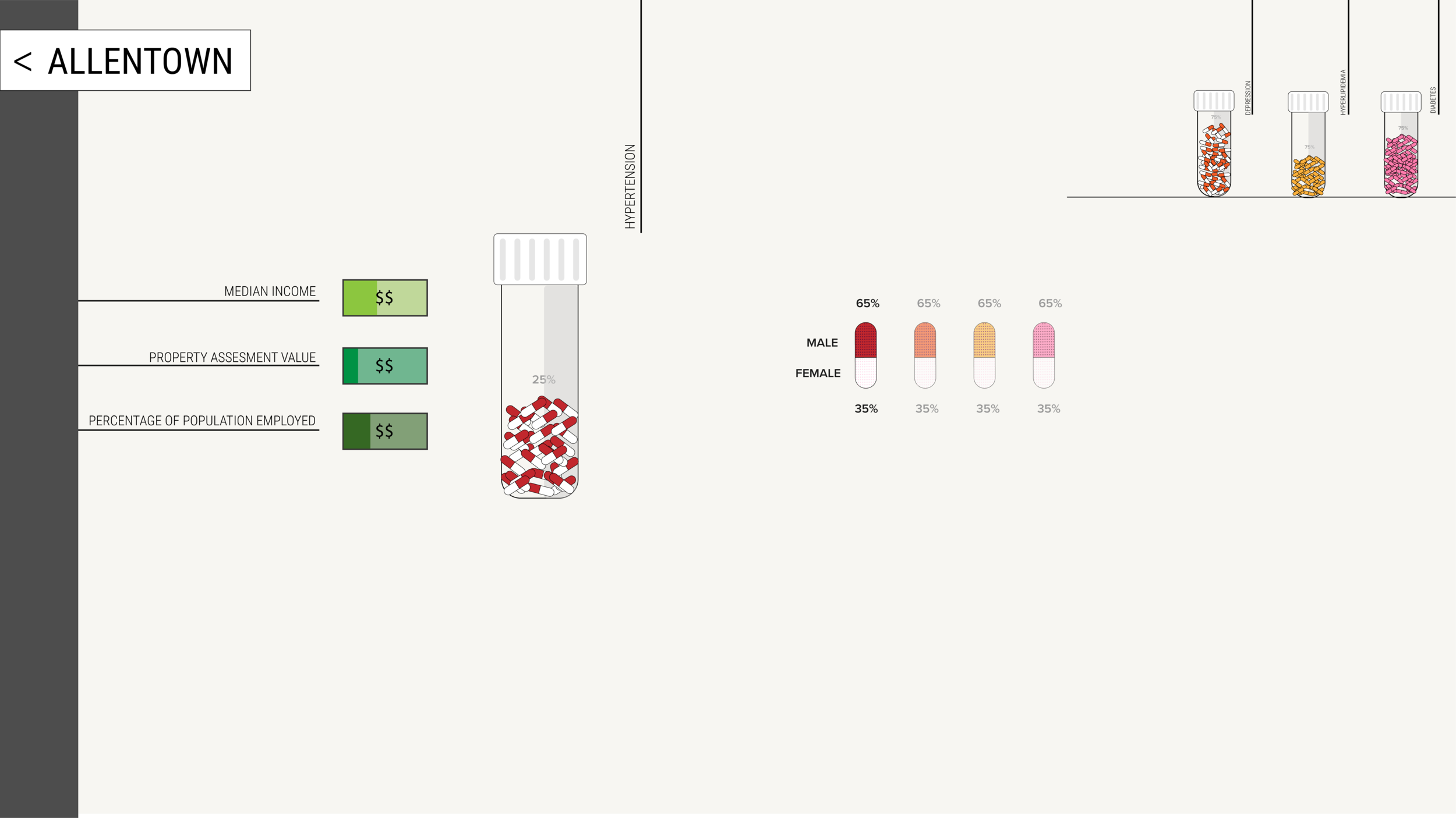
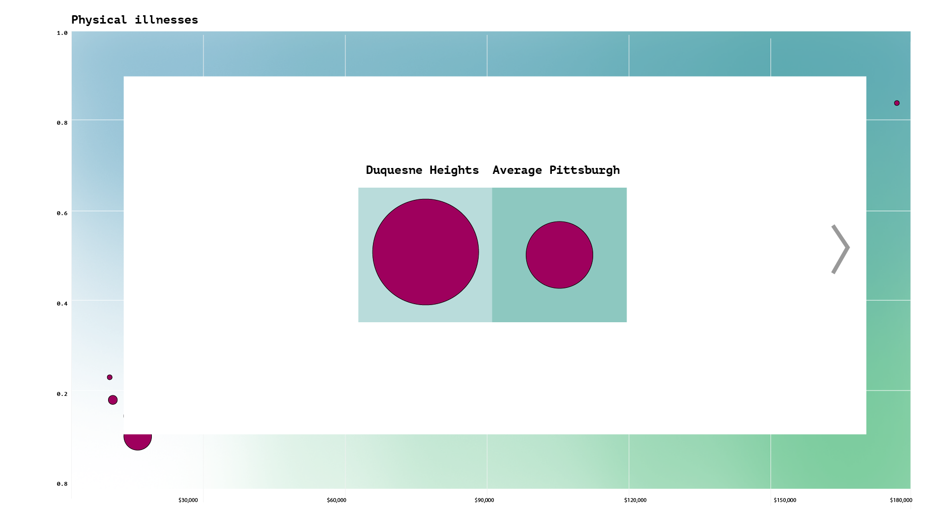
On clicking on a specific neighbourhood, one gets more details on the average income of the neighborhood.

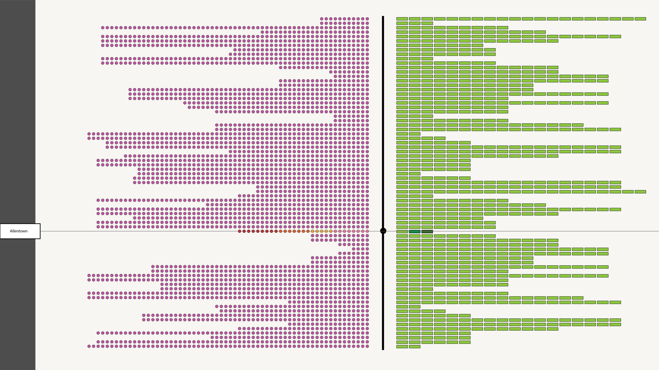
If one turns on the Compare Neighborhoods function through the toggle button, then they can select and compare multiple neighborhoods.

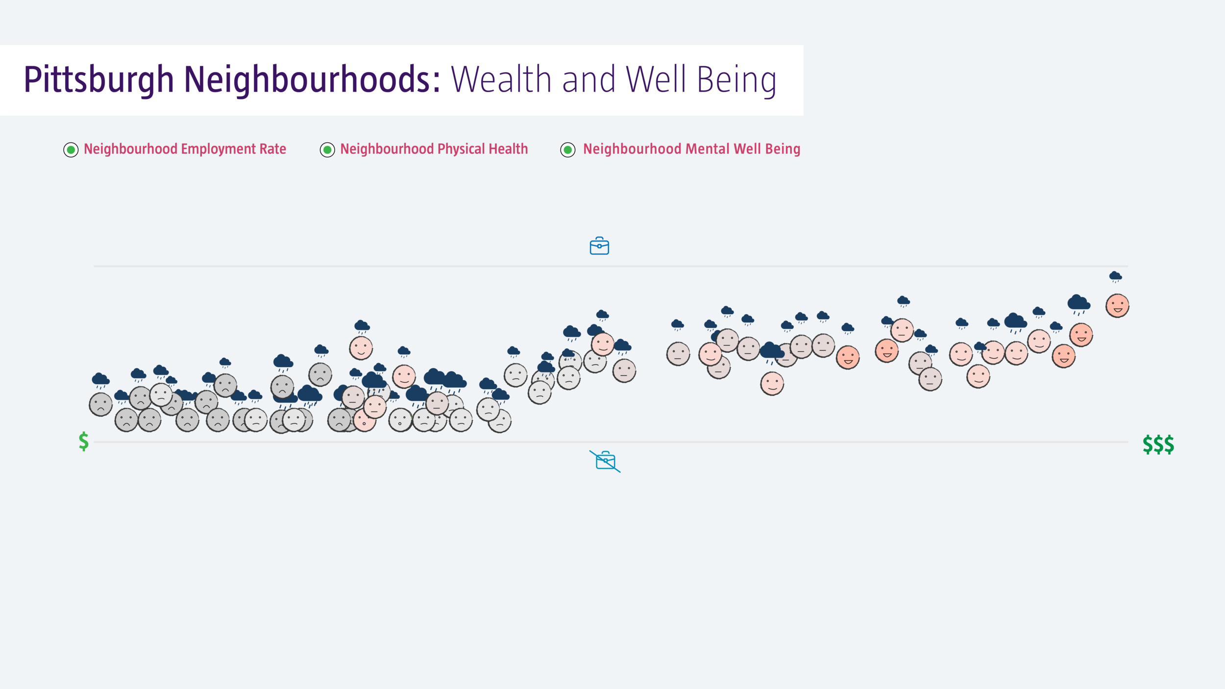
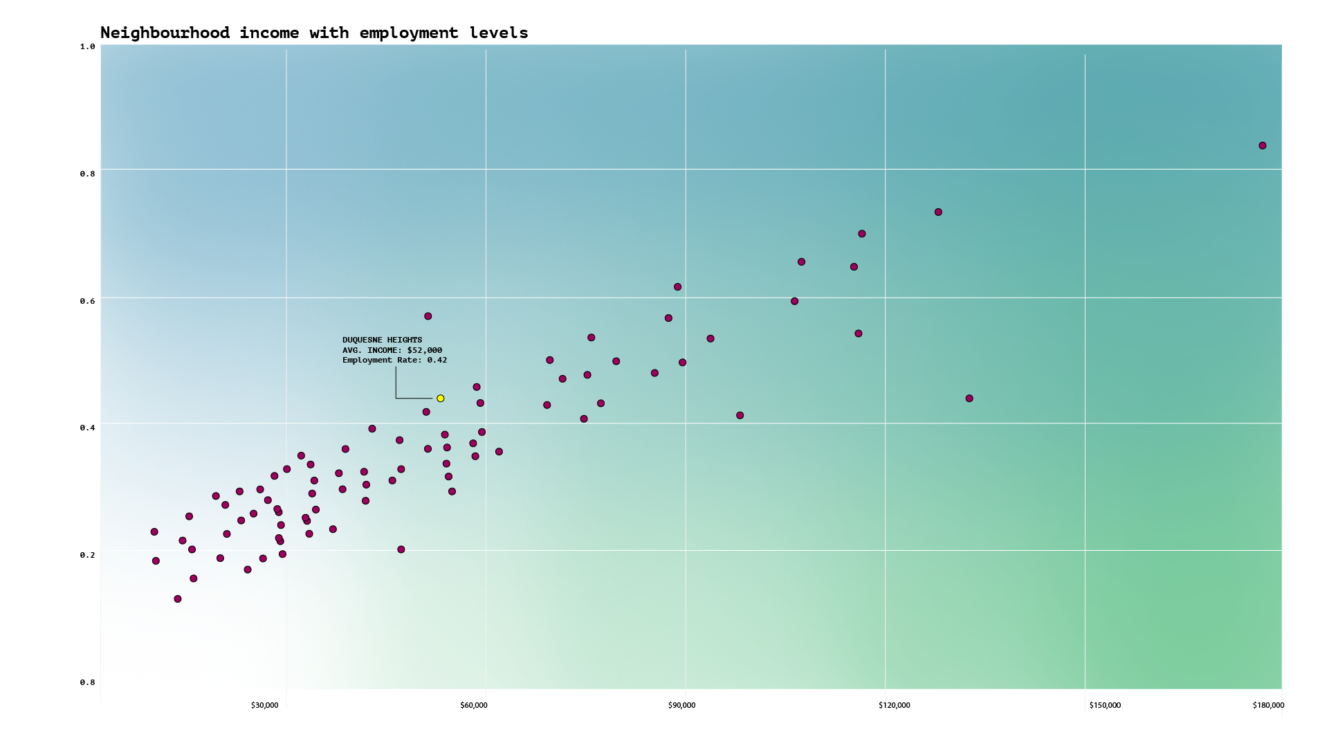
In the next stage, one can turn on and off the three radio buttons: Employment Rate, Physical Health, Mental Well-Being. By turning on the employment rate the neighborhoods spread out on the y-axis.

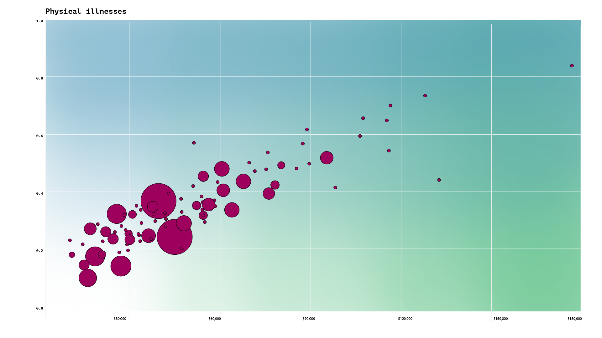
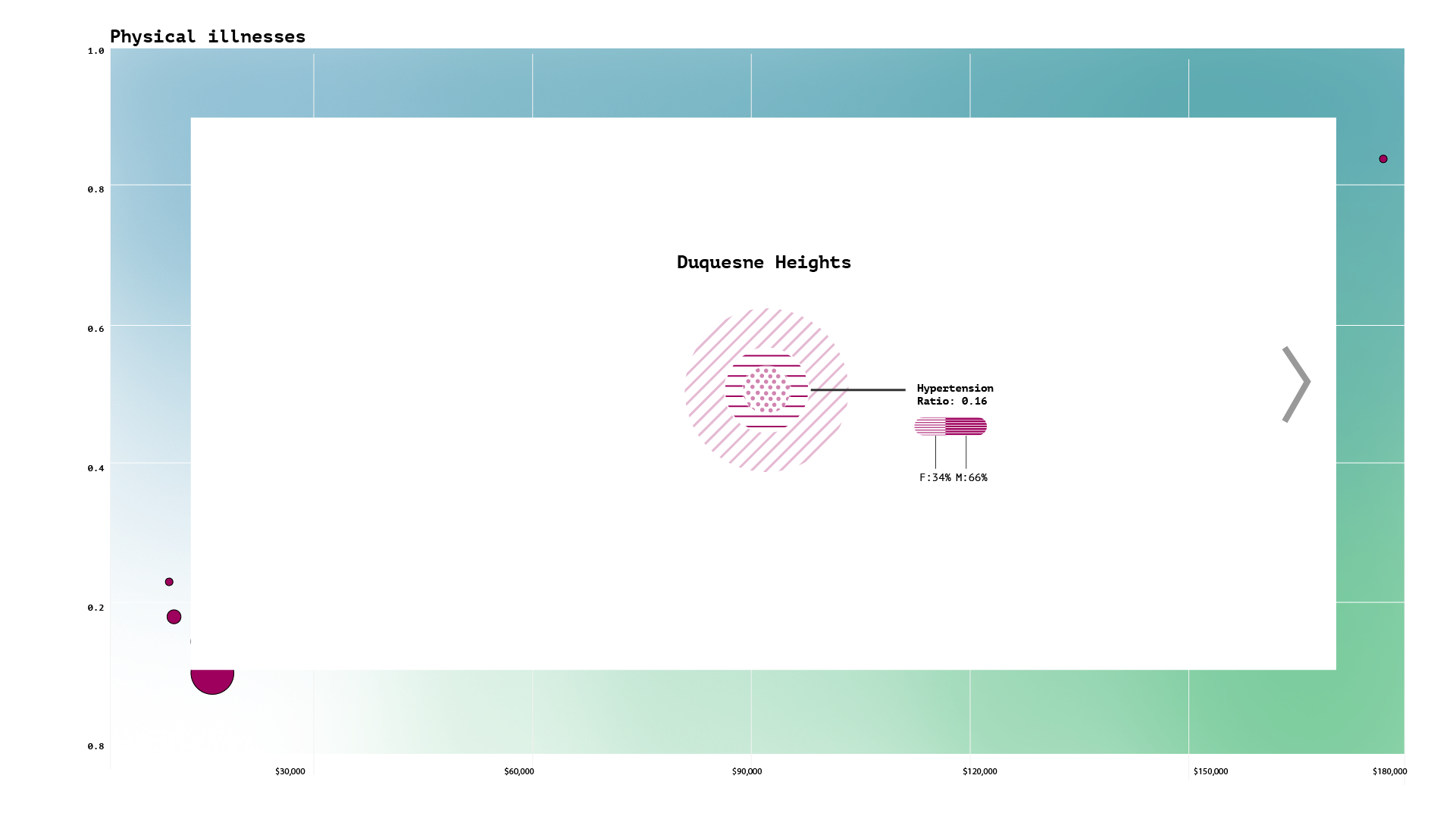
Next, on turning on the physical health button the health of the neighborhoods is revealed through change in the colour and expression.

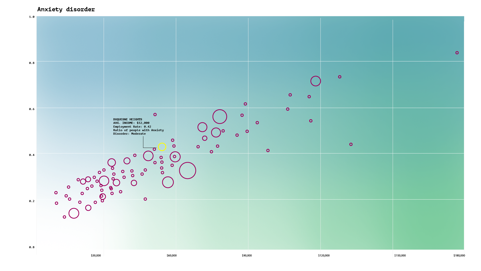
On turning on the mental health tab the clouds appear over the faces to show the quality of mental well-being.

Throughout the process, one can click on any neighborhood to see quantitative information.

Final stage
How I got there...
Iteration #1
Learning: There was too much cognitive overload on screen 1. It's important to differentiate between additive vs integrative approach.
Iteration 2


Learning: My variables seemed very abstract here. I was suggested to adopted a more human quality to the visualisation.
The final concept

Learning
Data visualisation has been the toughest project to crack from conceptually. To be able to transform abstract numbers to tell a story where the variables maintain a close cognitive connection to the context was a huge learning. Through the process I also learnt how to build up similar paced sequences in a story while focussing on the micro-interactions and transitions. Moving forward I want to explore how I can add more granularity of information in the income and employment axis.
Detailed process blog here
